- Great concept but I need to consider how I will translate these ideas in a visual sense that creates and adds to the atmosphere.
- Must figure out how I intend to create this visual world with the limitations we face i.e. budget, crew size, studio size, etc
Logo Designs
Given that graphic design is something that also requires it's own study and practice it's inevitable that I will require someone who understands the process of creating logo's and translating the client's idea to image. However, there are several text generators online that give you workable and even quality looking texts that are good for logos. I made use of Flaming texts logo design to create these really cool logos. I chose two different colours and texts as I have two different sets in mind for the presentation. One is opting for the acceptable blue whilst the other is leaning more towards a very daring red.
Given that graphic design is something that also requires it's own study and practice it's inevitable that I will require someone who understands the process of creating logo's and translating the client's idea to image. However, there are several text generators online that give you workable and even quality looking texts that are good for logos. I made use of Flaming texts logo design to create these really cool logos. I chose two different colours and texts as I have two different sets in mind for the presentation. One is opting for the acceptable blue whilst the other is leaning more towards a very daring red.
 Locked logo 1 (fig 1.1)
Locked Logo 2 (fig 1.2)
Inspiration: Es Devlin

Es is an award winning international stage designer who has worked with great names and events such as the olympics Rio 2016, London's olympics closing ceremony 2012, Adele, U2, Kanye West, Take that and the renown fashion house of LouisVuitton. Her designs are always eccentric and full of colour boasting energy and an incredible vibe that allow the audience to escape the fixed dimensions of reality. Some of my favourite set/stage designs she has created have a connecting theme or aspect that kind of create a certain feel that locked needs. The darkness adopted really isolates the characters, musicians, or performers on stage. The lights are used to colour the dark in a way that urges you to feel a certain feeling. For example blue lights against darkness would create a trance like mood with a tranquil feel about it. In the case of locked, red lights would make for a more interesting approach on the show's concept to emphasise vulnerability and the feeling of danger or an evil power.
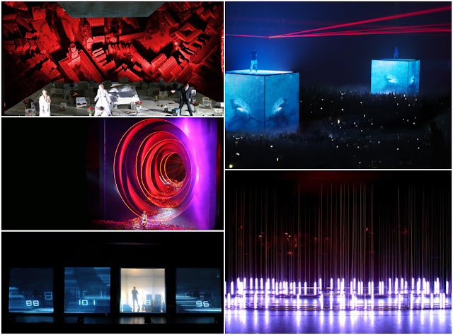
Story telling visually through elaborate set designs (fig 2.3)

Photo of Es Devlin (fig 2.1)
Use of lights and colour to create a mood that will evoke a reaction in the audience (fig 2.2)

Story telling visually through elaborate set designs (fig 2.3)

Visual Ideas and themes
To explore the concept of my game in a visual manner involves a great deal of visual storytelling. In order to understand what I want to put across to the audience visually, I must create or form from what is existing of this idea already a story that can be told visually to the audience through the set. So that once the audience enter they're completely taken aback and drawn into a whole new world. In addition, I created a logo that really sells a visual idea that clings close to a vulnerable and creepy vibe so hopefully my visual interpretation lives up to the expectation
Mock up drawing of Set Design (from stage view/perspective)


what would work best for the idea. I intend to put both into my presentation as given that it will be judged by a panel their criticism may help me to decide which set is better suited to the program. It is a well known fact that blue and red are popular colours and being primary colours isn't the only thing they have in common. Both colours are associated with meanings and sighs that direct us and other things. Blue and red are popular colours in marketing and advertising. It is also said that blue has a serene and tranquil calming effect on the mind and body hence it's association with feelings of hope, peace, harmony. etc. On the other, red is a colour of warning, danger, evil and signs. it is known mostly for it's use in road signs, and news channels when informing of the public of something urgent on the news. The red set was created for a more theatrical vibe as it would create room to allow me characterise the contestants and host in accordance with the background story of the game.
 The Blue set however, was created bearing in mind a less theatrical vibe and one that falls more in line with the game shows we see on television today. For example, The cube stimulates excitement through it's use of lighting and good set design. The name links directly to the concept and desin of the games which creates an understanding and liking for the game.


0 comments:
Post a Comment